S&O Auto Web Design
Direction | Design
Industry
UX/UI
Year
2019
Client
S&O Auto
Driven by Design
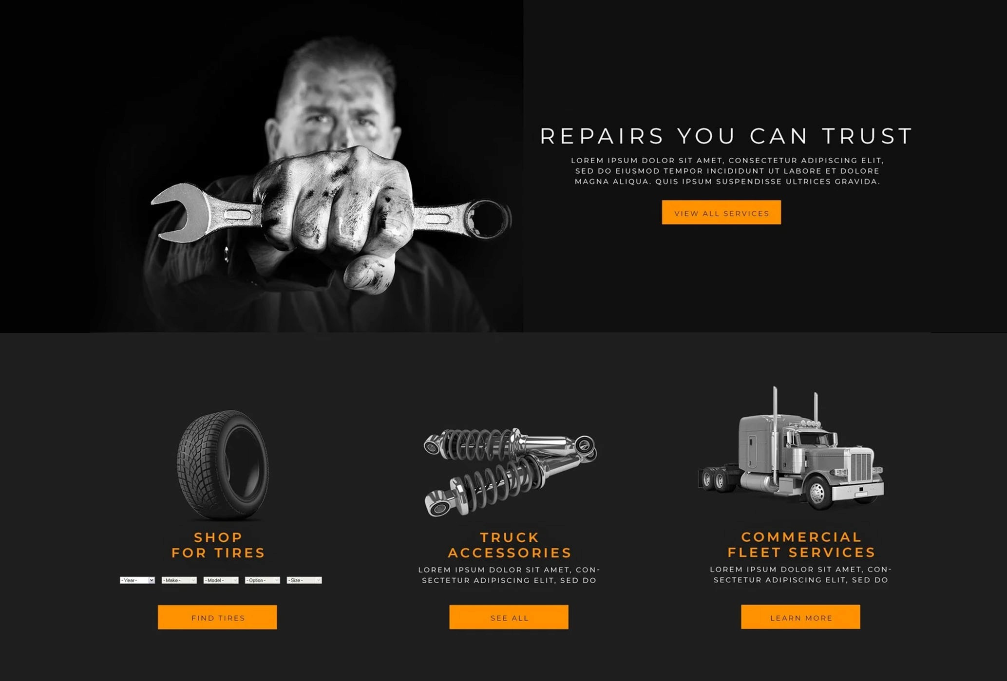
The client came to us with a very clear visual directive: “We want something clean, sleek, and minimal—keep color to a minimum, and lean heavily on black-and-white photography.” While this aesthetic direction set a strong foundation, our role extended beyond simply executing their preferences. We needed to translate that vision into a high-performing, conversion-focused web experience tailored to the automotive space.
Working within a minimalist framework, we focused on creating a design system that felt refined without sacrificing usability. Black-and-white imagery helped establish a sense of professionalism and trust, while also reducing visual noise; allowing users to focus on key actions like scheduling services or browsing tire options. This was especially important given the functional nature of the site, where clarity and ease of navigation directly impact customer conversion.
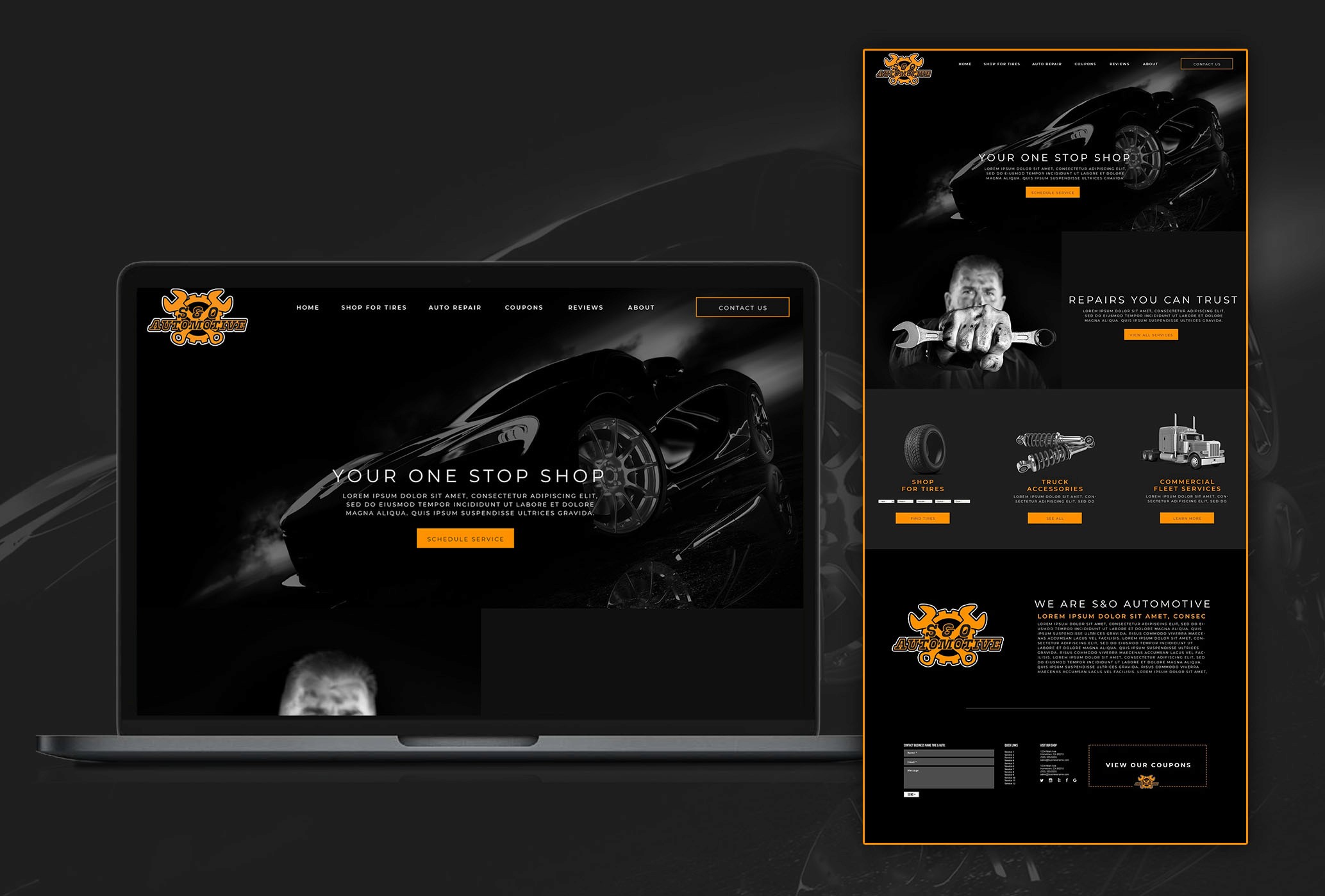
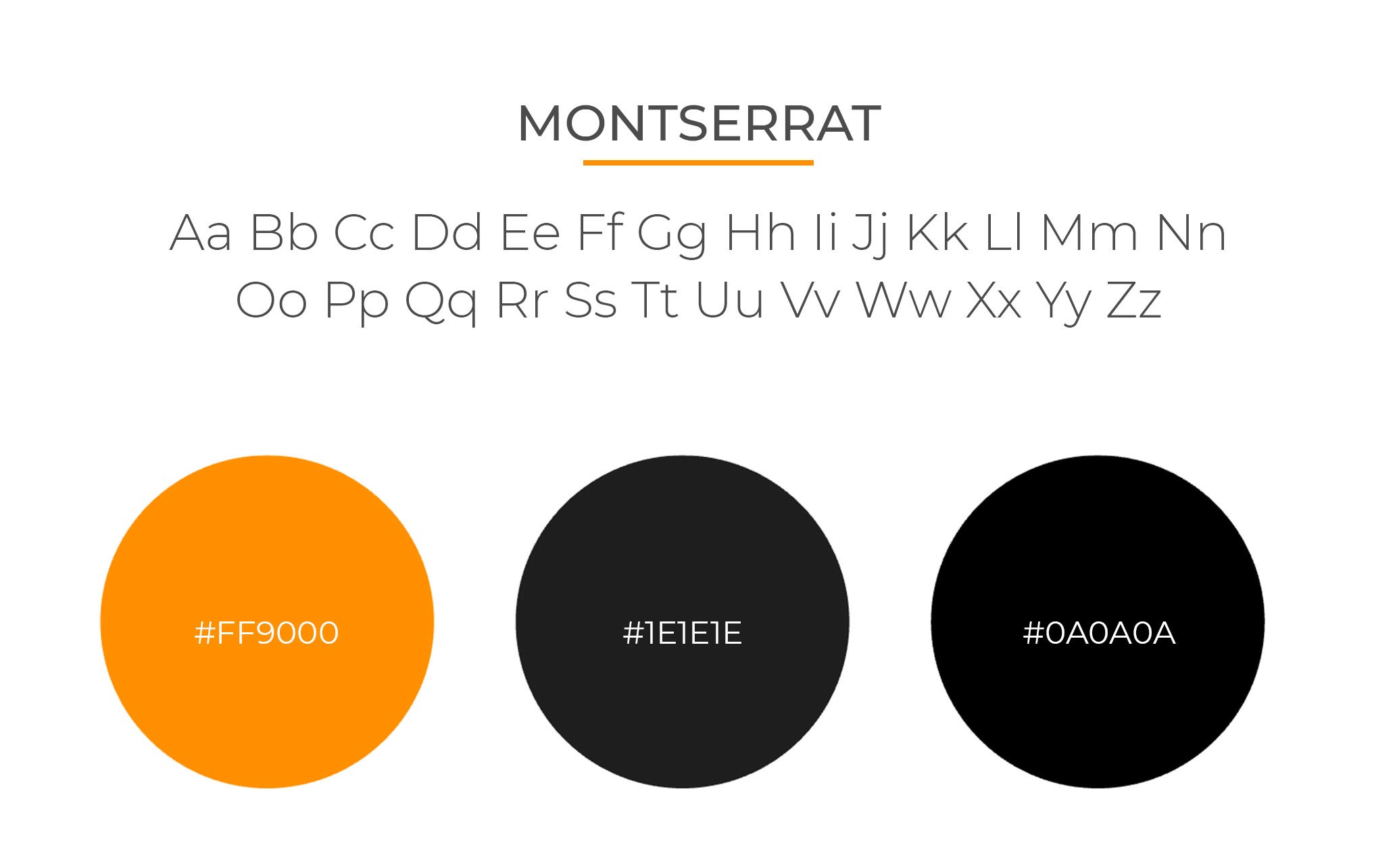
However, one strategic opportunity stood out: the client’s brand included a bold, vibrant orange in their logo. Rather than excluding it to maintain strict minimalism, we saw an opportunity to use it with intention. By reserving this color exclusively for calls-to-action, such as “Schedule Service” and “Shop Tires”, we were able to create a strong visual hierarchy that guided users naturally through the site. Against the otherwise monochromatic interface, the orange became a powerful tool for directing attention, improving engagement, and ultimately driving conversions.
This approach allowed us to honor the client’s desire for a sleek, understated aesthetic while still leveraging proven UX principles. The end result was a site that felt modern and elevated, but also highly functional helping in balancing form and performance in a way that supported both the brand identity and business goals.